Friday, April 13, 2018
Creative Critical Reflection
Well guys, it truly has been a blast making this project but wow I am so happy we finished it! Thank you to the cast for helping us create such a cool film and my group members for being awesome. Special thanks to our teacher for supporting us and we hope you enjoyed our film!!!! Below you'll find my CCR where I talk more about my reflection on the project:
Thursday, April 12, 2018
Poster and Website + Video Clip
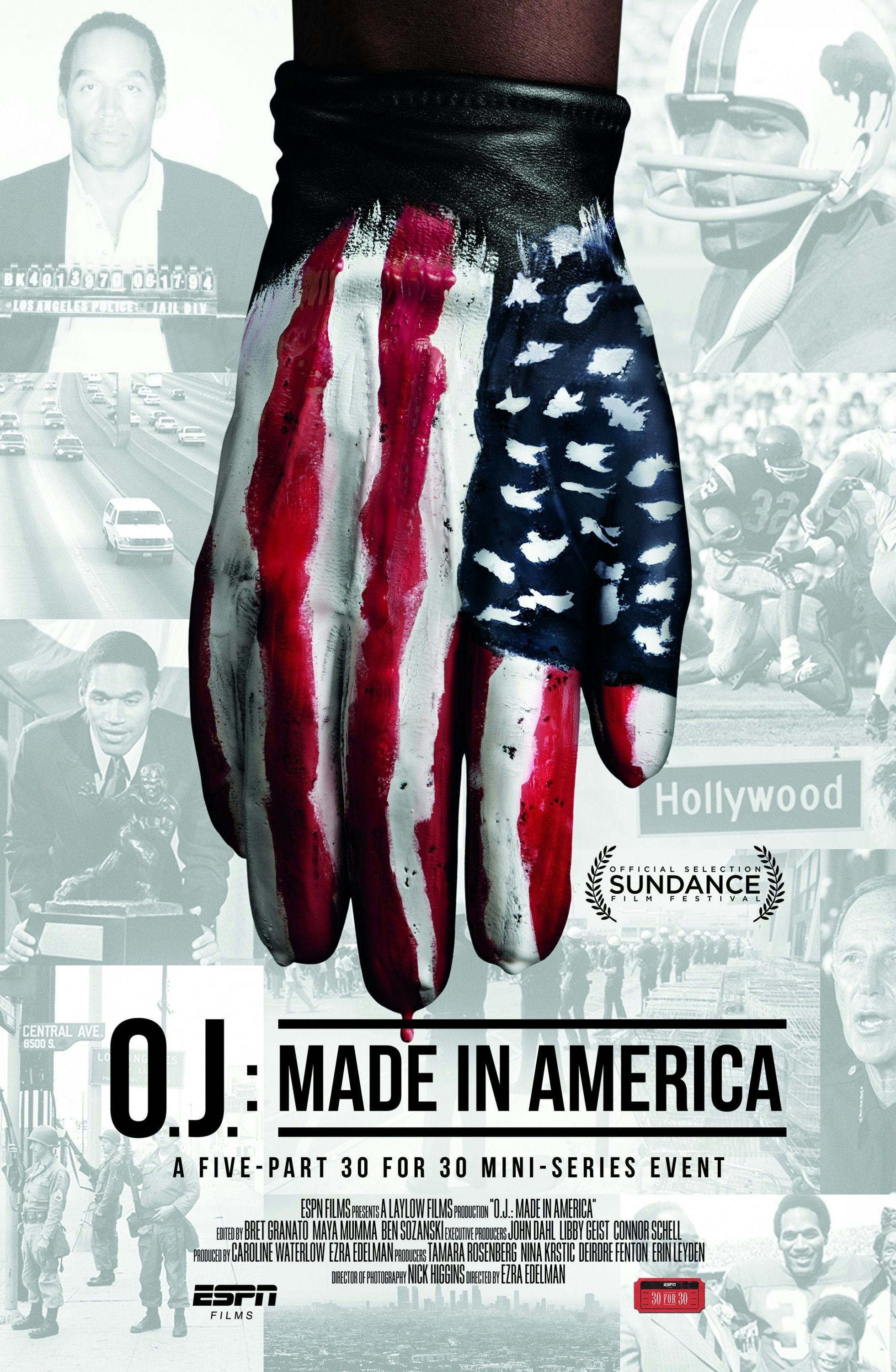
Alright guys, sorry for not really updating you but here's our final product! Below you will see all of our digital and print components of the project. We wanted a super simple, minimalist and overall intriguing poster and website and we truly hope you guys enjoy our video! Until next time :-)

(Documentary excerpt)

(Poster)
Website: https://isabelmayapineda.wixsite.com/perception
Friday, April 6, 2018
Group Critiques Pt. 2
Today I met up with my classmates Blake, Paloma, Manuela and Eitan to critique each other's pages. Going into the meeting was a little nerve wracking not because of the content we had, but more of how far along we are with our project and if we were behind. Turns out, we are all on the same page even though we have different project themes. Most of them did a short film or a music video, so even though there are several components to each one we all seem to be working on the website or editing. I showed them my blog and they said that I should change the font and the layout just a tad bit, so if this looks different in a few days and you liked the layout well I'm sorry in advance :-(
Besides that, they also helped me brainstorm ideas for the title of our project. Blake and I came up with Perception and Isa's group came up with Across the Ages. While I do like both, I feel like Across the Ages sounds more of a title that would be associated with a sci-fi or historic documentary as opposed to one about how each generation is represented in the media and society. We are still brainstorming just in case, but I reallllly like Perception because it's simple and straightforward. Now for the rest of this week, we have to finish the website and the poster, so I will keep you guys updated throughout the following several days. I hope we can finish earlier than the due date so I can relieve any worries about last minute tweaks to our project or any mistakes that could have been prevented. I hope this project is going to turn out as well as I think it will!!!! (please help us)

Wednesday, April 4, 2018
Intro to Website
So in the beginning of class we decided to see what type of website we wanted and what company to use. At first, we thought of weebly because that was one we used last year a lot in the AS level and were familiar with it. However, once we started looking at student samples that were provided to us we saw that most students used wixsite. I asked around my class and most of my peers said they were going to use either wix or squarespace. I heard that wix was really easy to use but that squarespace you may have to pay but it looks more professional. However, once we really started looking we saw that wix gave us the option of searching what the website was for and how we can design it. Once we searched up the word "movie" we saw how most of them were either for film students to display their work or a design made for promotion. Here is an example of what the templates would look like:
 Same thing as the last post, it's not the color scheme we want but the overall layout is similar to what we had in mind. As a result, we are going to use wix because everyone recommended it and said it looks professional depending on the layout. Another aspect of wix I really liked is that some features can move, so it makes the website more intriguing and appealing. We have one more week to do this...we got this!!!

Monday, April 2, 2018
Poster Inspiration
Today in class, my group member Maria was absent so Isa and I decided to start looking at website designs and poster ideas. In the 90 minutes we had, we saw various ideas of how we can make our poster and which website design we can use. We also brainstormed several different platforms where we would be able to distribute our project, however we decided to think about the distribution later this week in order to finish one step at a time. On Netflix, we saw posters like the ones below that inspired us:


What these posters all have in common is that they all provide images that help viewers catch a glimpse of what the series is about but intrigue them enough for them to watch it. Our objective for the poster is to create one that will intrigue our target audience (which we still have to research on YELP). You know,something simple that will get our message across without being too much. Our documentary series is not dark, so the color scheme of all of these colors is unnecessary. What we have been discussing so far is what color scheme we want, but Isa and I have to discuss it with Maria so we can all be on the same page and get a consensus. Guess you'll have to wait till later to find out!
Subscribe to:
Posts (Atom)
Creative Critical Reflection
Well guys, it truly has been a blast making this project but wow I am so happy we finished it! Thank you to the cast for helping us create s...

-
Well guys, it truly has been a blast making this project but wow I am so happy we finished it! Thank you to the cast for helping us create s...
-
Oh, did I mention how Isa's sister (our other supposed interviewee) bailed on us? Let me explain. We filmed at Isa's aunt's...
-
Alright guys, sorry for not really updating you but here's our final product! Below you will see all of our digital and print component...

